Collections
15 Baffling But Oddly Beautiful Infographics From The 'Military Industrial Complex'
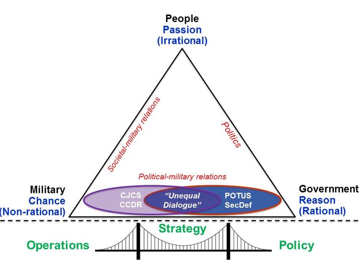
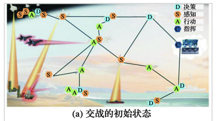
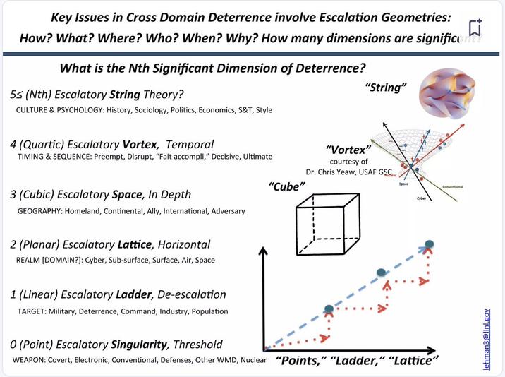
Step aside, deep-fried memes: the freakiest graphic design on the internet comes from the United States defense-industrial complex. The world's militaries love to make slide decks, and they have a lot of complicated notions to theorize about. On Twitter / X the account @DefenseCharts gathers up the wackiest, most creative diagrams from the defense industry to celebrate.
Many of these slides do not make sense, which perhaps is a commentary on the state of military theorizing today. But some of them are hypnotically colorful, surreal, and evidence of a kind of imagination and creative thinking that might be a good sign. Whether it's comparing the future of warfare to theoretical physics, musing about the difference between simulation and reality in the context of cyber warfare, or using wacky graphics to advertise a new weapon system, the Department of Defense has a unique and inimitable visual language. The only you can do is step aside and let them cook.


