Meme Encyclopedia
Media
Editorials
More

Popular right now

Jaden Newman Twitter Video Leak

Jaden Newman Twitter Video Leak

Owen Carry

Owen Carry • about a year ago

La Peace meme example.

La Peace

Phillip Hamilton

Phillip Hamilton • 3 days ago

Topiary

Topiary

Don Caldwell

Don Caldwell • 15 years ago

Fruit of the Loom Cornucopia Mandela Effect showing the imagined and real logos.

Fruit of the Loom Mandela Effect

Philipp Kachalin

Philipp Kachalin • 3 years ago

text reading "brat summer" in reference to charli xcx's album.

Brat Summer

Phillip Hamilton

Phillip Hamilton • 2 years ago

Know Your Meme is the property of Literally Media ©2024 Literally Media. All Rights Reserved.

Collections

25 Design Choices That Make You Wonder Who Approved The Layout
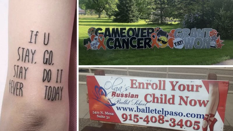
Examples of badly designed signs and art.

77 views
Published August 03, 2026

Published August 03, 2026

There are plenty of ways for text to go wrong, but few are as entertaining as putting perfectly normal words in the wrong arrangement. A sign, shirt, advertisement or piece of packaging can have a completely sensible message until you read it from the direction your brain naturally wants to read it.

The result can be nonsense, an accidental joke or a sentence that sounds considerably more alarming than whatever the creator actually intended.

Some of the funniest examples aren't even technically mistakes. The words are exactly where the designer wanted them, and the intended reading order is clear if you stop and think about it. The problem is that nobody naturally wants to stop and think about it. You see text, and your eyes immediately start reading.

That's how an innocent message can suddenly become something completely ridiculous.

The 25 images in this collection feature all kinds of unfortunate arrangements. Some signs appear to issue bizarre instructions, clothing that creates strange sentences, advertisements with unfortunate combinations of words and other pieces of media that become much harder to understand once you read them from left to right.

It's a simple problem with an endless supply of examples. All it takes is some text, a questionable layout and a reader who refuses to follow the instructions.
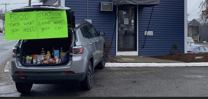
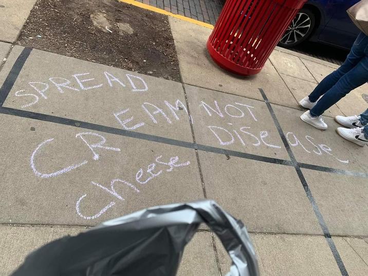
Their heart is in the right place. The words, not so much

(Source: Reddit)

Spread cream not cheese disease

(Source: Reddit)

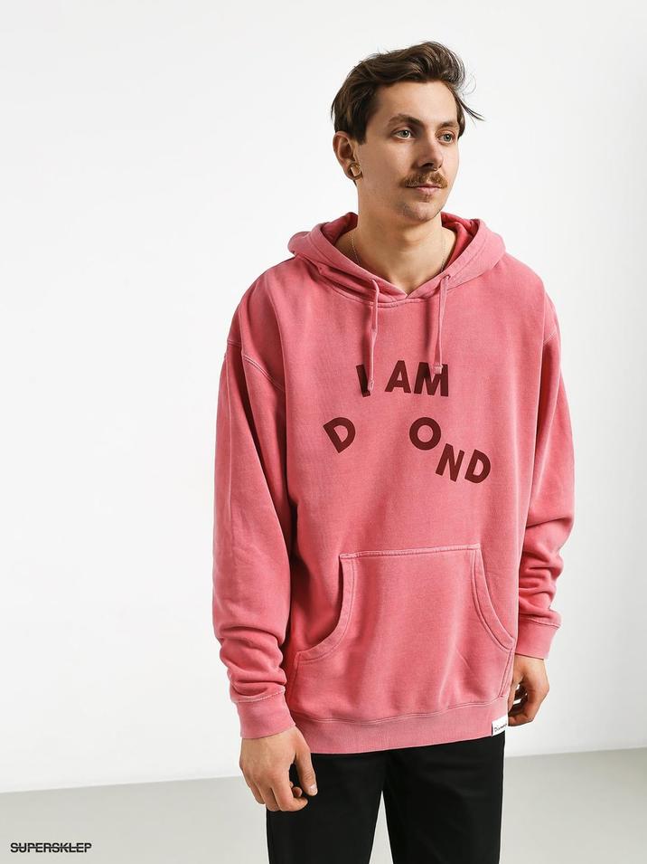
I AM DOND

(Source: Reddit)

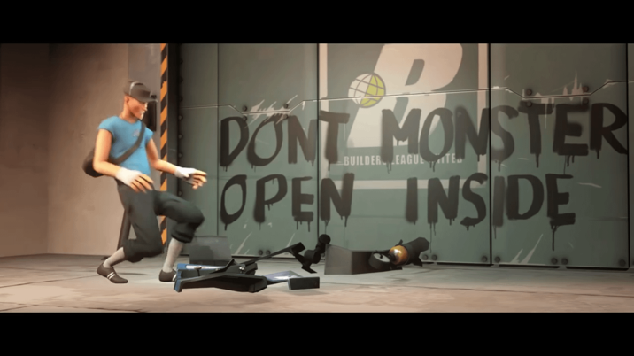
TF2

(Source: Reddit)

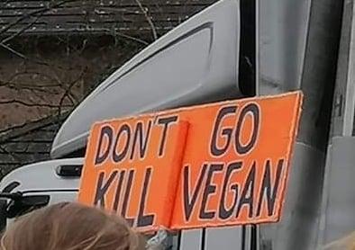
DON'T GO KILL VEGAN

(Source: Reddit)

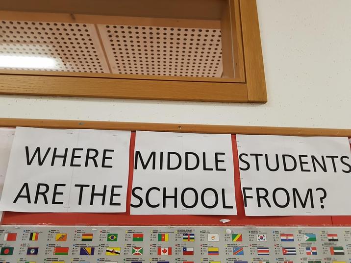
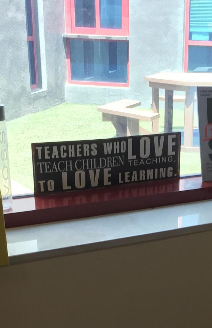
This sign at my international school

(Source: Reddit)

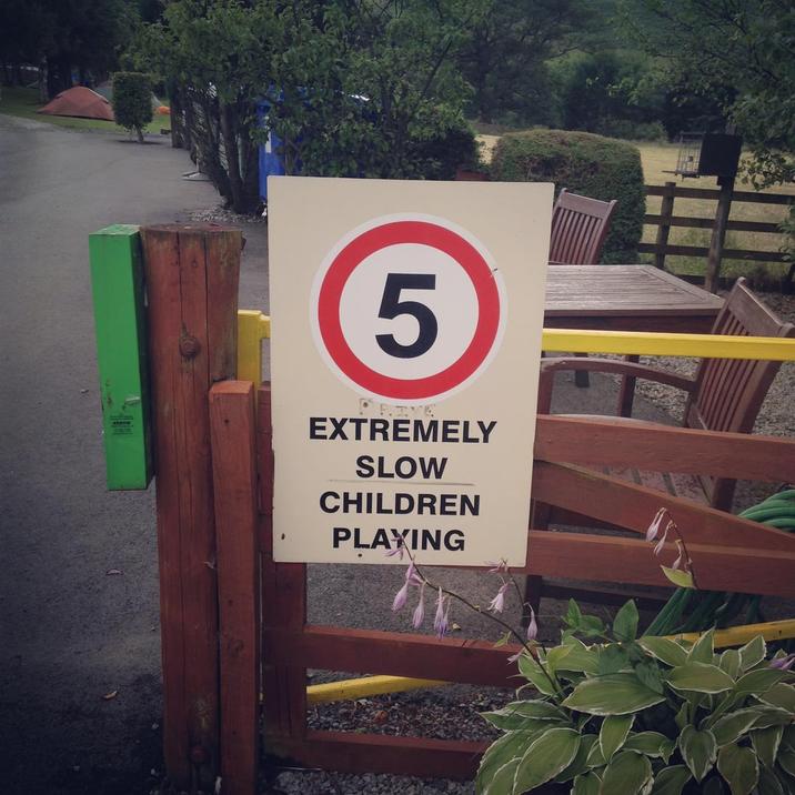
5 extremely slow children playing

(Source: Reddit)

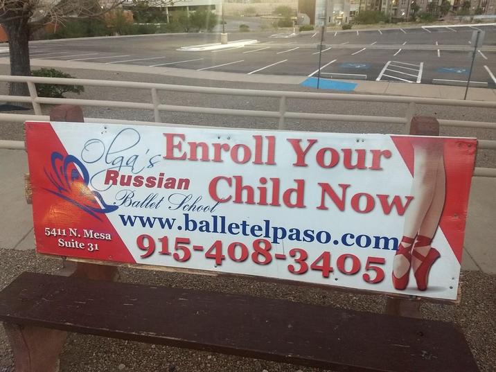
Enroll Your Russian Child Now

(Source: Reddit)

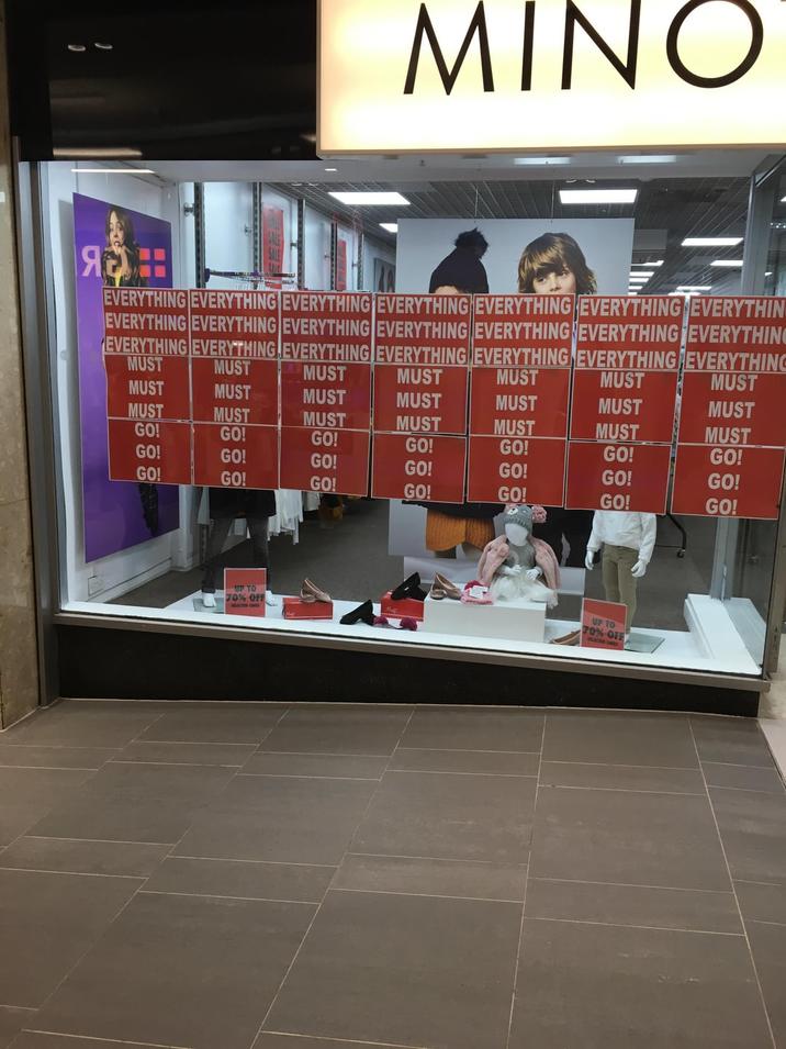
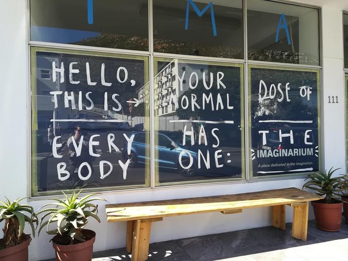
EVERYTHING

(Source: Reddit)

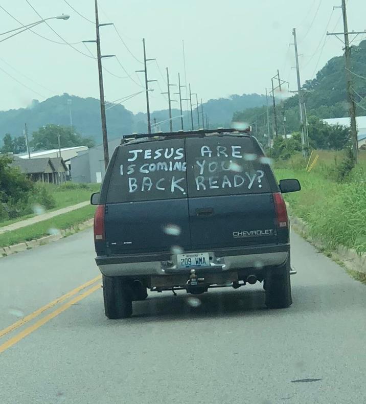
Stroke sentence

(Source: Reddit)

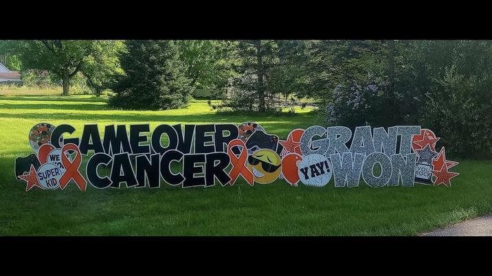
Game over Grant, cancer won

(Source: Reddit)

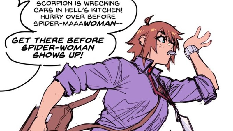
Took me multiple tries to figure this out

(Source: Reddit)

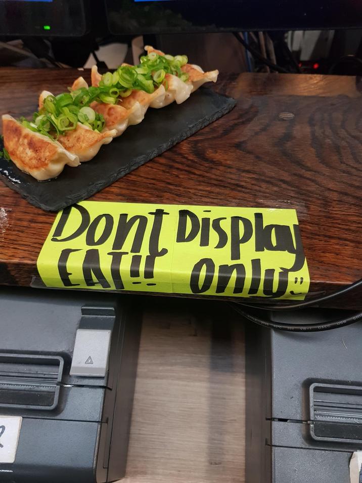
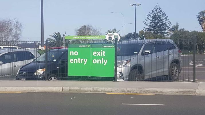
Well, if you insist

(Source: Reddit)

Was there even an intended order to begin with?

(Source: Reddit)

I give up

(Source: Reddit)

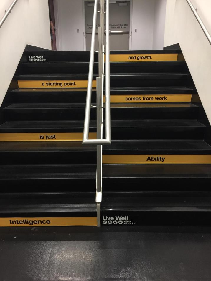
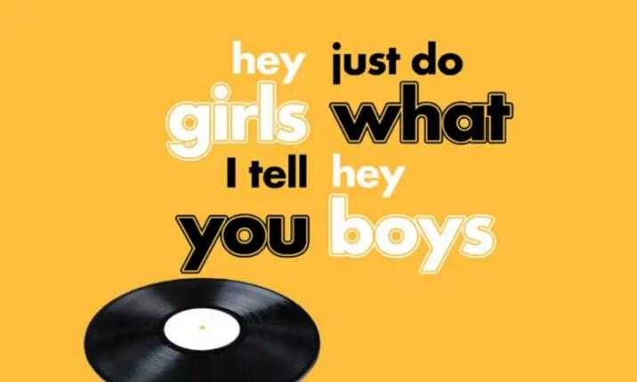
IQ test for some.

(Source: Reddit)

You think some tattooist hate their own work?

(Source: Reddit)

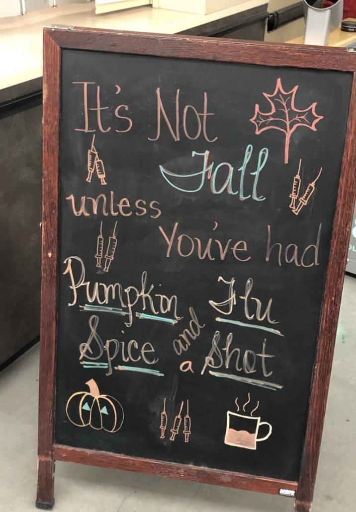
Spicey vaccine

(Source: Reddit)

Does this count as a DON'T DEAD OPEN INSIDE?

(Source: Reddit)

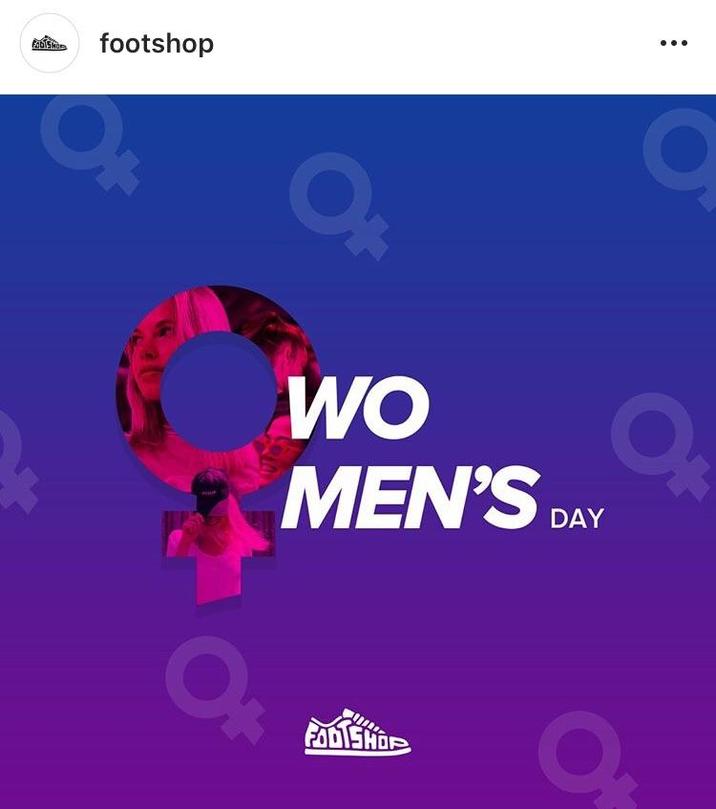
OwO Men's Day

(Source: Reddit)

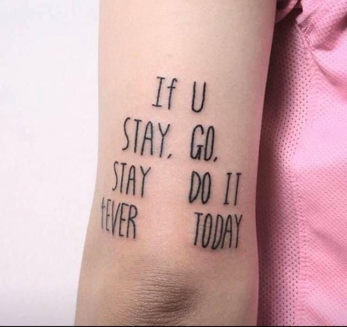
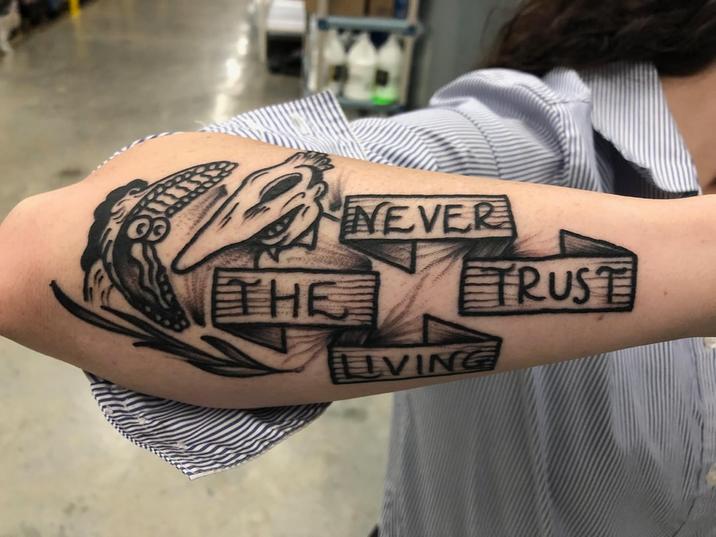
Friend of a friend got a new tattoo

(Source: Reddit)

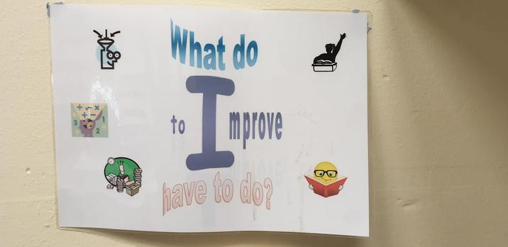
What do?

(Source: Reddit)

Found this gem in Arabic class today

(Source: Reddit)

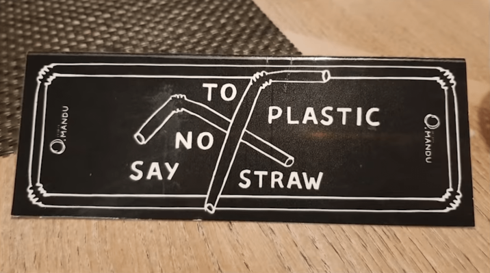
To Plastic No Say Straw

(Source: Reddit)

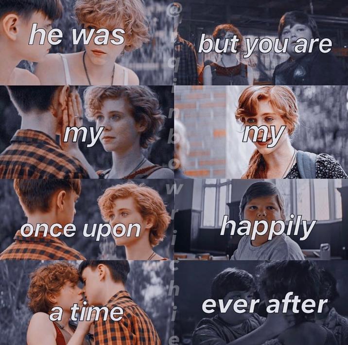
RIP my last brain cell

(Source: Reddit)

Tags: funny signs, bad signs, hard to read, bad formatting, read wrong, funny, humor, design,


Meme Encyclopedia
Media
Editorials
More